Benda, Natalie C.; Zikmund-Fisher, Brian J.; Sharma, Mohit M.; Johnson, Stephen B.; Demetres, Michelle; Delgado, Diana; Ancker, Jessica S. “How Difference Tasks Are Affected by Probability Format, Part 2: A Making Numbers Meaningful Systematic Review.” MDM Policy and Practice 10, no. 1 (2025): 1. https://doi.org/10.1177/23814683241310242.
The way health information is presented—especially numbers about risks and benefits—can have a big impact on how people understand and respond to it. To explore this, the Making Numbers Meaningful team reviewed over 100 studies to see how different presentation formats affect people’s reactions when comparing probabilities, like how much a treatment lowers the chance of a disease coming back. They found that people were more influenced by numbers shown as relative differences (for example, saying a treatment “cuts the risk in half”) than absolute differences (like saying it “reduces risk by 2%”). People also responded more strongly to charts that focused only on the number affected, rather than showing the full picture, and were more persuaded when messages included personal stories or information about what other people chose. Bar charts were generally preferred over icon-style graphics, especially when they included labels showing exact numbers. Overall, the review showed that the format used to present health statistics can shape how effective people think a treatment is, how much they trust the information, what choices they intend to make, and which formats they prefer. This means that clear and thoughtful presentation of numbers is essential for helping people make informed health decisions.
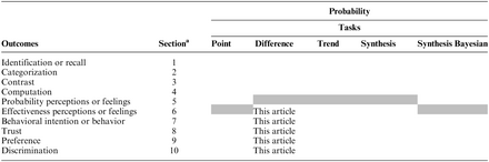 Table A
This standardized numbering system has been used for results subheadings in this article and across all Making Numbers Meaningful results articles to ensure that readers can find comparable information in all articles. Gray cells represent combinations that are not possible according to the definitions presented in Ancker et al.1