Featured Project Archive
Designing for the Cadaver Ball
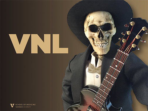
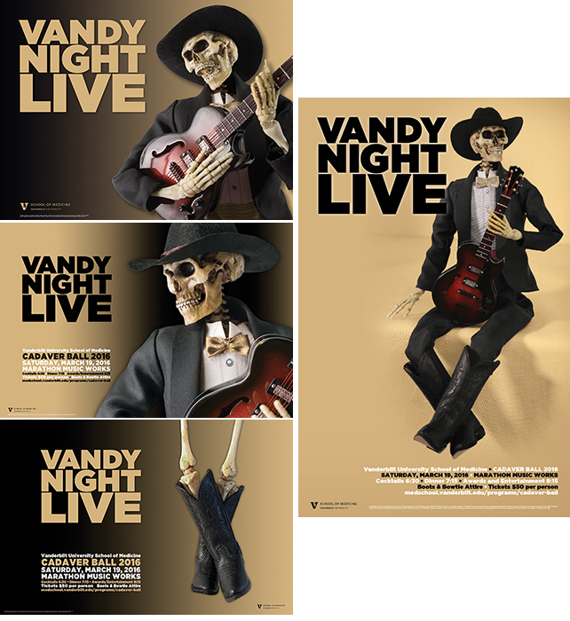
Marketing Solutions accepted a new challenge this year, designing the promotional materials for the annual Cadaver Ball for the School of Medicine. The event celebrates first-year medical students completing Gross Anatomy. Each year organizers select a theme which spoofs a popular culture icon. “Mr. Bones,” a skeletal representation of the cadavers they work with, is always the central figure. “Vandy Night Live” was the theme of this year’s event.
Taking inspiration from Saturday Night Live and Nashville's country music scene, senior graphic designer Chris Collins sought out the perfect elements to execute the concept. Using a 1:10 scale posable skeleton allowed Chris and photographers Steve Green and John Russell to manipulate the model with ease. Chris borrowed a tuxedo from a Ken doll and purchased Barbie doll-sized cowboy boots and a hat to get the country-western look he was after. A guitar Christmas tree ornament was the perfect final embellishment to turn this model into a country music star.

Chris took roughly 100 preliminary shots on his iPhone to determine the best poses. Those poses were narrowed down to the top twenty and then passed along to the committee in charge of the event at the School of Medicine. Once those poses were narrowed further, John, Steve, and Chris worked together to get the professional shots needed for the promotional materials.
Chris ultimately used five different poses on five pieces. The original images were touched up in Photoshop so that they would seem less spooky and more playful. The actual tie and cummerbund were pink, but were changed to the Vanderbilt gold in the final versions used.
Zwischen Leben Und Tod program

Marketing Solutions was asked to design the program for the Blair School of Music’s world premiere of Zwischen Leben Und Tod, by Michael Hersch. The musical performance in itself was unique in that it engaged violin and piano to interpret the paintings of graphic artist Peter Weiss. Our office provided a simple yet striking layout that aptly matched the unique presentation by Blair Dean Mark Wait and Professor Carolyn Huebl. Emerald paper, metallic inks, carefully chosen typeface, vellum paper, and Weiss’ intriguing images merge to make this publication convey the feel of the performance and the works of Weiss and Hersch.
Custom Card Designs
Every year, Marketing Solutions designs custom cards for different departments. These designs are uniquely Vanderbilt and are specifically designed to fit the needs of clients while staying within defined departmental budgets. Here is a sampling of the holiday cards that we designed in 2014.
Chancellor’s Holiday Card
This chancellor’s holiday card uses varying sizes of custom designed white foil snowflakes on metallic gold paper to create a elegant and dreamy feel. The envelope features the same snowflakes in gold metallic ink on special white textured paper.

Library Holiday Card
The 2014 library holiday card features an illustration from the book Our Sentimental Garden, by Agnes and Egerton Castle. The 2-sided card contains a quote that suits the image from the book perfectly. A fly sheet printed on a special opaque paper incorporates a note from the interim dean printed in gold metallic ink. This card is paired with a white envelope printed in gold metallic ink.

Housing Holiday Card
The 2014 housing holiday card is a simple, inexpensive, yet stylish card. The front of the card features a Vanderbilt University campus image that was carefully chosen from our wide selection of images taken by our staff photographers. The card is paired with a white envelope printed with black ink.

Engineering School New Year’s Card
In growing anticipation of the new engineering and science building — currently under construction — the Engineering School wanted to send out something innovative and unique this year. The greeting card designed by our office features a simple black and white sketch of the new building with gold foil lettering on a white paper. When the building sketch is viewed via phone with a special app, a 3-D model offering 360-degree views of the Engineering and Science building is revealed. (link to http://www.vanderbilt.edu/provost/esb/) The app which transforms the drawing to 3-D was developed by a School of Engineering student and professor. The finishing touch is the beautiful coordinated gold metallic envelope.

Blair School of Music New Year’s Card
In continuance of the celebration of its 50th anniversary, the Blair School of Music requested a special New Year’s card to send to its patrons. The card incorporates their 50th anniversary logo and branding elements of the gold foil circles and tendrils which we designed earlier in the year. This card is printed on a shimmery cream paper and is mailed in a coordinating envelope with gold foil stamping.

Blair School of Music 50th Anniversary Brand

In celebration of its 50th anniversary, the Blair School of Music requested a special visual identity that would be used to mark this milestone on materials for the next three semesters. Senior graphic designer Julie Turner crafted design elements including circles and tendrils that complement a modern mark containing the number fifty. The circles and tendrils evoke the feel of a bubbly celebration. The mark itself features a circle that sits in the center of the zero in the number fifty, giving the look and feel of a gold record. This element emphasizes Blair’s exceptional musical achievements. Black and gold also accentuate a pride in Vanderbilt traditions.
The 50th anniversary branding launched in January 2014 with an exquisite new year greeting card. This was quickly followed with the Spring Concert Series booklet, as well as the Crescendo year-end summary. Ads and other publications also carry the brand elements. All of these designs use signature elements which brands the celebration across the year.

|
| Fall 2014 Concert Series, Roland Schneller invitation, Crescendo, Spring 2014 Concert Series, Blair greeting card |
Divinity School Dean Installation (Invitation & Program)

The elegant invitation and matching event program featured above were brought to life by a tight collaboration between Marketing Solutions and its client, the Vanderbilt Divinity School. Divinity School staff came to coordinator Donna Smith in need of a sophisticated invitation to celebrate the installation and convocation of Dean Emilie M. Townes.
The solemn occasion called for a sophisticated and elegant invitation, so Smith teamed with senior graphic designer, Jenni Ohnstad to create a classic, yet memorable card that would stand out among a stack of mundane mail. Ohnstad purposefully selected a long rectangular shape for the invitation card, and the card’s visual highlight is undeniably the detailed gold foil etching of Benton Chapel, a longtime symbol of the school. The corresponding invitation envelope adds yet another flash of elegance with its textural character and subtle coating of gold particles.
For the subsequent event program, Ohnstad establishes consistency by once again using beige paper with black, burgundy, and gold text. In addition to replicating the invitation’s color palette, Ohnstad also reuses the timeless etching of Benton Chapel, which serves as a beautiful focal point yet again.
“The Calm Before the Storm” Football Schedule poster

Bleacher Report ranked this design second in the “Top 50, 2012 Team Schedule Posters.” The design concept is a perfect example of what can come from a collaborative effort between photography and design. Presented with the task of coming up with a design that would communicate anticipation of something “big” on the horizon, photographer John Russell, and designer Mike Smeltzer, set to work. They felt that a strong, single, non-identifiable player would be most effective. They took a powerful and dominating shot of a player. Then they added photographic techniques to ensure that the model’s face would be unrecognizable and that the muscles on his arms would stand out. The anchor, an iconic image of strength, was used to further drive the point. The jersey with the number 12 was used to coincide with unleashing this storm in 2012.
Viewbook

The Vanderbilt viewbook is the flagship publication for the Office of Undergraduate Admissions. Writers, designers, and photographers collaborate early in the year on the new direction to showcase the university to potential students and their parents. The same style and branded look are applied to other admissions office publications throughout the year. In addition to the main viewbook, for example, there are more detailed brochures describing the College of Arts and Science, Blair School of Music, School of Engineering, and Peabody College.
Blair Concert Series
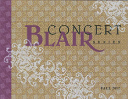
As a direct mail promotional piece for music events at Blair, the Blair Concert Series book needs to stand out. Designer Julie Turner chose to create a unique, hand-crafted look for the cover, using opaque white, purple, and black inks on French Construction Fuse Green paper, and adding an overlay of pearlized foil stamping in a rhythmic graphic pattern. Characters from the font Hypnopaedia were used for the foil graphic, as well as for the smaller background pattern, and were repeated in a more subtle fashion throughout the interior pages. The book’s horizontal format allowed more variety in the layout of the featured artists' photos.
Open Dores

Open Dores is the publication sent to accepted students each spring. You may have heard about the "stripping party" that happens each spring in Undergraduate Admissions. Stripping refers to the act of peeling off the adhesive strip from the envelope to seal the acceptance packet. Open Dores mails in March each year to approximately 4,500 accepted students along with the letter of acceptance and other material. It is designed to re-inspire the most highly desired of our applicants to say "YES!" to our offer of acceptance. Since not every accepted student will in fact accept the offer, more acceptances are sent than there are actual places in the first-year class. Through careful calculations, Enrollment Management figures on a "yield," which results in the final 1,650 students who will actually move in to The Ingram Commons in August. This particular publication is produced with a five-color process that includes metallic gold 873, Vanderbilt's official gold color. It also features a cover flap, a play on the concept of opening a door, a reference to starting a new journey. A pocket on the inside back cover provides a spot for several additional flyers that are tucked into the mailing, depending on the school that the student has been accepted to.
The video demonstrates more fully the 3-d quality of the printed publication experience.